Thursday 27 December 2012

RISK ASSESSMENT

DAY 1 - 3rd January 2013 

Filming in a basement: 
  • Lighting is going to be an issue as there is no natural light in the basement. 
  • May not be enough space to film as it is quite confined, also the shots I want to film may also be altered depending on the space available.
Dealing with these problems:
I can easily create more light in the space, but also, I can use the lack of lighting to my advantage as the scene is supposed to look dreary and dark. 

DAY 2 - 4th January 2013 

Filming in someone's corridor and dining room: 
  • May get in the way of people living in the house. 
  • Again space may be an issue as these areas may be a little confined depending on the different shots. 
  • Lighting isn't an issue as there is a lot of natural light within the space however there isn't long periods of decent natural light during winter months. 
Dealing with these problems:
As there is only one day of filming plus one of the residents of the house will be acting in it, I don't feel that it will be too much of an issue however it is just as a precaution my main aim will be to get the filming done quickly and efficiently to make full use of the house. Filming at a decent time before it gets too dark will also have to be a main priority. 


Wednesday 26 December 2012

SHOT LIST - 'stevie's wonders'

1) Begins with an extreme close up of Steven, zooms out, slowly revealing the setting and circumstances (tied up in a basement) 
2) Mid shot 
3) Side angle shot, showing side of his face.
4) Back to mid shot of shot two
5) Extreme close up, showing his hands tied behind his back. 
6) Returns to mid shot of shot 4 
7) Reaction shot, close up 
8) Close up of Steven untying his hands and chucking the rope at the floor
9) Close up of Steven ripping off gaffa tape and shouting at his mother 
10) Panning shot of Steven walking up the stairs 
11) Mid shot of Steven's feet on stairs 
12) Panning shot of Steven's dining room 
13) Close up of plate with director's credit 


Sunday 23 December 2012

SCRIPT FOR FILM OPENING

This is the final script I will be using for filming on the 3rd and 4th of January. In comparison to other film openings I have looked at for research, there is little dialogue, the majority being the voice over at the beginning which will be added during post production. 

SCRIPT
Stevie - Steven. C
Stevie's Mother - Patricia. T

(Stevie, looking distressed, dusty and messy with duct tape on his mouth is tied to a chair in a basement)

Voice in Stevie's head: 

'Day 2...trapped down here...tied to this chair...'

'I have a feeling my team are dead, which means its just me left, god' 

'Ah, it smells down here... is that mould?' 

'I have been frantically trying to untie my hands for hours, not yet been successful'  

'I can't hear any signs of life...I think its only a matter of time before...' 

Stevie's Mother: "Steeeveeennn, dinner's ready...Come out of the basement... You are spending too much time playing down there. Come on, sweetie." 

(Stevie pulls his hands free, rips duct tape of his mouth)

Stevie: "MUUUUM. You ruin everything!!! -sighs- " 

(Stevie gets off chair, begins to walk up the stairs) 

Stevie's Mother: (faintly) "Don't be like that, honey." 

(Steven walks out of basement and into his dining room where his mother gives him his dinner, ruffles his hair and brushes the dirt off his shirt) 

(Steven then sighs and stares at his dinner then looks up at the camera with the same distressed face)

Thursday 20 December 2012

TITLES PLANNING


TITLES PLANNING 
For the opening sequence, this would be the ideal potential crew for this film, based on previous work they have carried out and certain styles and genres that are evident within the work they produce. 

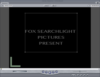
Distributor - Fox Searchlight Pictures
Fox Searchlight Pictures, established in 1994, is an American film division of Fox Entertainment Group alongside the larger Fox studio 20th Century Fox. It specializes in independent and British films, alongside dramedy and horror as well as non-English-language films, and is variously involved with the production and/or distribution of these films.


Production Company - Dune Entertainment III 
Dune Entertainment is a motion picture financing and production company affiliated with 20th Century Fox. They have made many films in the similar genre to mine (action/comedy), creating films like 'I Love You, Beth Cooper', 'Diary of a Wimpy Kid', 'The Watch' etc. 


Opening Director Credit - 'An Alice Rudwick Film' 
Actor Credit - 'Steven Chambers' 
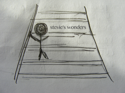
Film Title - 'stevie's wonders' 


Casting Director - Jory Weitz
A producer and renound casting director for many of the films I have gotten inspiration on. In each of these films, I feel he has got the actors exactly right for each of the roles. Examples - 'Napoloen Dynamite', 'Nacho Libre', 'The Big Empty' 


Music - Composed by Matthew Jones 
My friend who will be writing the music. 


Production Design - David Doemberg
Production designer David Doernberg, who brought a sensitive, finely crafted and observant touch to many excellent independent films, died in New York in March. Once I had realised this, I had considered taking him out of the titles to keep the reality of the titles however his work has been an inspiration working on films like 'Nick & Nora's Infinite Playlist', 'Junebug', 'Gummo'.  

Editor - Munn Powell 
Again an editor that has created films I have sought inspiration from. Munn Powell's films include Gentlemen Broncos, Napoleon Dynamite, and The Sasquatch Gang.


Director Of Photography - Eric Steelberg
Eric Steelberg, a 32-year-old cinematographer who lensed two of the year’s finest and most visually-beautiful films, “500 Days of Summer” and “Up in the Air”, both of which are insant-classics. Everything he films is a work of art and adding the the list of inspiring film makers. 

Writer - Diablo Cody 
Final Director Credit - Alice Rudwick 

Wednesday 19 December 2012

INITIAL PLANNING - FILM OPENING

Film Opening Planning
Film Title -  Stevie's Wonders
Summary - A teenage boy, obsessed with violent action and mystery films becomes consumed by trying to solve his own mystery. Little does he know he is digging a little too deep when this hobby becomes part of something bigger when he discovers a mafia boss has control of his little town. 

Genre - Comedy/Action  
Target audience - Under 25's, probably students rather than an older audience.
Location - Dreary basement, very homely dining room - showing the contrast between the life he has and the life he wished he had. 


I want the film opening to initially shocking the audience, and providing suspense. I intend to use a deceiving, seemingly non-linear narrative, by getting the audience to ask particular questions, like who is he? Why is he there? etc. The comedy will be provided through the sudden change in genre from what seems like thriller to a teenage comedy.  through the very brief dialogue, the audience should get an idea of who and what this character is like. Everything about the opening scene and titles will be done to deceive the audience into thinking the film is something it isn't. 
Originally when planning my film, I wanted to include a predominately adult cast as I think it would bring a greater sense of reality into the film opening. However, because of the genre and plot, the main protagonist needs to be a teenage boy. The cast for the opening is just going to be the boy and his mother, however you do not get to see the mother's face, just her torso, voice and hands. This not only keeps the focus on his character but also emphasizes the importance of seeing the world through his eyes, showing the insignificance of her character to him. Although we can also see this through the dialogue, this is a much more subtle way of projecting their relationship. 


Monday 17 December 2012

ANALYSING OPENING TITLES - Indiana Jones

Indiana Jones - Raiders of the Lost Ark (1981)- Steven Spielberg

raiders4.jpg
raiders5.jpg
  • Beginning of film is playing as the opening credits show. 
  • The action/adventure genre is apparent through the setting and the action. 
  • Indiana Jones is shown through a range of close up shots, immediately highlighting the fact he is the main protagonist. 
  • The audience also get an idea of his characters bravery and slight mystery. Not only does he stride around with an elevated power-house attitude but the fact that you don't see his face until after the titles adds to the mysterious elements of his persona. 
  • Many diegetic sounds used in the scene highlight the fact that the setting is dangerous and it is a bad place to be. The two other men are scared whilst the solitary character in Jones contrasts with them. 
  • Also the use of iconic costumes, theme music and weapon choice for Indiana builds up the character. 


ANALYSING OPENING TITLES - Pride & Prejudice

Pride and Prejudice (2005) - Joe Wright
  • The opening slightly introduces the female character of Lizzie Bennet, letting the audience know she is the main protagonist. The fact she is reading shows she's intellectual and educated. 
  • Initially the opening begins with bird song which plays before the title sequence and then as the rural setting is introduced there is emphasis on the calm, tranquil setting. It then changes as the sun comes up, the music ties in to the setting and interestingly the first piano note plays as the sun rises. The music ties in with the setting through non-diegetic piano.
  • As Lizzie walks, a long tracking shot is used which introduces the audience to the Bennet house by splitting away from her and moves through the house, its as if you as individuals in the audience are walking around their house. These elongated tracking shots are iconic in Wright's films. 
  • The large house indicates that they are wealthy and of slight economic importance.  The maids are shown, and even though she is dressed modestly, the audience is not confused with her class. 
  • The mess on the table is predominantly female, being bonnets and dresses which gives the audience an insight into the characters. 

ANALYSING OPENING TITLES - Jaws

Jaws (1975) - Steven Spielberg 
  • The film opens with a tense opening sequence, which begins with two iconic minor notes which immediately builds tension with the audience. 
  • the first interesting shot from this opening is the point of view shot of something moving in the water. Accompanied with the tense theme music which begins to build up as the title 'JAWS' shows, the audience already can tell that it is a villain.
  • The second interesting shot is a tracking shot of two people running along the beach. The accompanying diegetic sounds of the beach highlighting the sounds of the ocean and water which may again create a tense atmosphere as you know something bad will happen in the sea just from the title sequence and music from before. 
  • The third example of camera movement is the shot as she is being attacked from under the water. The shot shows half of her body above the water and just her reaction as she is being killed. The camera follows her body as she is being killed.
  • The camera follows her body as it flails around in the water, effectively filling the audience with horror as the death is so sudden and horrific. 
  • Another way tension is built effectively in this type of shot is through the editing. The shot-reverse-shot which shows the girl above the water and then shows the point of view shot of the 'thing' coming up to get her from under the water. 
  • The shot below the surface alarms the viewer as along with the unsettling accompaniment of the theme music as the villain gets closer.


Monday 3 December 2012

ANALYSING OPENING TITLES - An Angel At My Table

An Angel At My Table (1990) - Jane Campion 
  • An Angel at My Table is a 1990 New Zealand-Australian-British film directed by Jane Campion. The film is based on Janet Frame's three autobiographies, To the Is-Land (1982), An Angel at My Table (1984), and The Envoy from Mirror City(1984)
  • The opening begins with simple, yellow and black titles. Accompanying this, simple and quite archaic folk music plays throughout the titles.  
  • Generally, the titles follow the usual structure of most films, however there are a few titles added such as 'Composer' and 'Sound Design' which wouldn't necessarily be seen in modern mainstream cinema. 
  • The opening shots are mostly point of view shots of a baby looking at a mother and then their view as the mother picks her up and hugs her. Initially these interesting shots look quite dated, but I think they not only add the the character and quirkiness of the film but also allow the audience to grasp that it is a past event. 
  • There is also no music at this point but it is replaced with diagetic sound of a baby gurgling and laughing, mostly this enhances the reality for the audience. 
  • The next shot is the one shown below, showing a very wide shot of the New Zealand country side. The shot, taken on a crane, slowly moves down as the girl gets closer to the camera however this movement is incredibly subtle. 
  • I think the most important part of this shot is the vivid contrast between the two different elements in the shots. Firstly you have the beautiful hills and long path and along it there is a girl. As the camera gets closer you see a short, chubby child with incredibly vibrant orange curly hair. She seems incredibly out of place which initially  creates some surprise within the audience and also foreshadows negativity in her life. 
  • The music begins again as the crane moves down closer to her face, and a voice over also begins; revealing to the audience a little more about her character.

ANALYSING OPENING TITLES - Once Upon a Time in the West

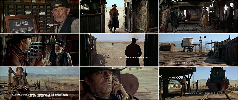
Once Upon a Time in the West - (1968) - Sergio Leone 
  • Once Upon a Time in the West is a 1968 Italian epic spaghetti western film directed by Sergio Leone for Paramount Pictures.
  • The interesting thing to note is that the filmmakers are using the different sounds to build tension. There’s no dialogue or music, but the sculpting of sound is as important as the visuals to create the mood and to set the scene; buzzing flies, dripping water, telegraph ticker, knuckles cracking, birds, train whistle, etc. It’s so long that the audience almost becomes frustrated at the slow, subdued pace. 
  • Leone chose to substitute music with amplified sound effects. The sequence is so elongated that the audience almost becomes frustrated at the slow, subdued pace. 
  • Impressively the use of animated titles was incredibly difficult especially before digital editing and unlike anything seen around the time. The transitions across the screen incorporate them into the scene.  
  • The titles are used imaginatively during the shots, setting it apart from other titles. 
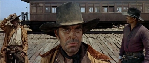
  • The camera angles and shots at the beginning already show the men to be the antagonists. This is firstly shown by the very slow pan across the train station room, showing all three of the men standing still in various doorways. The slow pan emphasizes the tension and shows that there is something wrong. Also, the use of low angle shots represents their status.
  • Snakey, the character who sits in the chair, is shown to be a very sinister character. When he captures the fly in the barrel, he listens to it buzzing and grins. This shows the nature of this character, he likes to have power and is fairly corrupt. 
  • The opening scene does a very good job of establishing the location and genre, there is no doubt that this is a western film. This is done by the use of classic iconography of the western genre. 
  • An example of this would be the stand-off at the end of the scene, a common sequence in western films. Another would be the harmonica music played by the protagonist in the scene, music that reflects not only the location but is used in other western films.


Monday 26 November 2012

ANALYSING OPENING TITLES - London to Brighton


London to Brighton (2006) - Paul Andrew Williams

  •      London to Brighton is a 2006 award-winning British film. The film was written and directed by Paul Andrew WilliamsThe film opens with a woman and child, Kelly and Joanne, bursting into a London toilet. Joanne is crying and Kelly has a black eye. Eventually Kelly gets them on a train to Brighton, and it is clear they are running from someone. Funded by the UK Film Council (now the B.F.I - British Film Institute). 
  •       London to Brighton is an impressively focused and direct film, with a frantic opening scene which sets both a style and mood that is maintained throughout. It soon transpires that we are witnessing the fall-out from some horrific, but as-yet-unknown event, and from here the story unfurls smartly to throw the scene into its full, harrowing context.
  •      The use of an enigmatic narrative immediately raised and asks questions. (What has happened to them? What is their relationship? Who is Derek? Why are they in a public toilet at 3:07am?)
  •      The audience gains sympathy for the young girl whereas the older woman seems threatening however the seemingly maternal relationship between them both makes her appear a little more emotive. 
  •      The opening is meant to engage you, simply by showing you a scene from midway in the film. The structure of the film is non-linear.Thus intriguing the audience and making them want to carry on watching the rest of the film. 
  •       The titles themselves don't actually give anything away about the film, just give you distribution and production company titles followed by a time and a place. They are just simple, black and white, nothing special; it is what happens after the titles that begins the sudden element of confusion and mystery to the film. The immediate, loud action of the beginning scene cuts into the audience, contrasting with the silent and simple titles. 

Monday 19 November 2012

ANALYSING OPENING TITLES - Alien

Alien (1979) - Ridley Scott
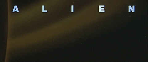
  •      Alien is a 1979 science fiction horror film directed by Ridley Scott and starring Tom Skerritt, Sigourney Weaver, Veronica Cartwright, Harry Dean Stanton, John Hurt, Ian Holm and Yaphet Kotto.
  •      The sequence beings with a panning shot of space, the slow subdued pace creates tension and the use of dark colors add to the mystery.
  •      Adding to this, the beginning of Jerry Goldstein's eerie score subtlety sets the tone of the film, creating tension.
  •      The title appears letter by letter which again adds to the mystery and keeps the audience attentive, trying to guess what its relevance is. But the genius is the slow reveal of the title, not even one letter at a time, but one element of each letter at a time, the long, disquieting lines taking eventual shape, much as the titular creature reveals itself one stage of its life cycle at a time before finally emerging as the Alien later in the film.
  •      Overall the titles are small and simplistic, so the audience is not deferred away from the main title (‘ALIEN’) 

Does it set up particular genre expectations?
The setting of the opening sequence of space immediately sets the scene. Not only that the film title, ‘ALIEN’ instantly notifies the audience about the theme of the film and adds to the sci-fi genre.
Does it introduce particular characters to the audience? If so, what does it tell the audience about the character?
The titles just present the main actors of the film. The opening titles don’t actually give away anything about the film, which does add to the subtle mystery that complements the film.
Does it introduce the setting of the movie? If so, what does it tell the audience about the setting?
The use of an interstellar expanse backdrop,  again slowly adds to the tension. Plus the use of the infinite black of space makes us wonder what is lurking within it. The overall effect is of this very slow paced, minimalist title sequence is the tension created is almost haunting to some degree and certainly leaves a lasting impression on the audience. 


Wednesday 14 November 2012

ANALYSING OPENING TITLES - Kill Bill Vol.1


Kill Bill Vol.1 (2003) - Quentin Tarantino
 Kill Bill (2003) movie title
  • First thing shown on screen - "Revenge is a dish best served cold" - Old Klingon Proverb 
  • Automatically, the audience gets an inkling the film will feature revenge of some sort. (Revenge - sub-genre of horror). Also Tarantino appeals to his fan base mostly because of his quirky inside joke references to geeky sub-cultures of film and television (i.e. using a Shakespearean quote and saying its from Starwars). 
  • "A 4th Quentin Tarantino film" - comes across as slightly pretentious? However it is an interesting way of introducing the director, and not one that many would choose (yet another thing that sets him apart from the rest) 
  • Sound of breathing during the distribution/production company title begins to build suspense as you hear the sound before you see anything. 
  • Beginning scene in black and white, not only complimenting the plain black and white title but also highlighting the fact that this part may be in the past, or not exactly what it seems. 
  • The first shot is a high angle shot of a woman, who has been beaten and is bleeding. She is breathing heavily, which shows she feels threatened and frightened. 
  • During this shot, footsteps can be heard behind the breathing, seeming to be getting closer. This heightens the anticipation of the scene as the audience is unaware of who the person is, but assumes that they are a threat. Also, the footsteps are quite rhythmical, almost mimicking an increasing heartbeat.
  • The extreme close up from the beginning along with no establishing shot begins tension immediately from the beginning - using an enigmatic narrative device. 
  • The second shot is a low angle tracking shot of someone's feet walking across floorboards. This connotes him as a threatening character, as we are not shown this character's face. In fact, in this film, Tarantino creates an enigma, as the audience is not shown Bill's face throughout the whole film.
  • Narrative automatically comes across as non-linear. Quentin Tarantino is infamous for using non-linear narratives in his films; a great example being 'Pulp Fiction' 
  • There are two different types of font seen. One large and interesting and one rather small and incredibly plain. However the smaller font is used for the main actors.
  • Interestingly, the four main characters are listed with numbers, again a feature for the geeky community following Tarantino as they are listed in the order they are eventually killed in, seen later in the film.

Kill Bill (2003) opening credits


Monday 12 November 2012

OPENING TITLES - INITIAL RESEARCH


TITLE SEQUENCES

The opening title sequence of a film is that film’s opportunity to make a good first impression on you, the viewer. A well-crafted title sequence introduces the audience to the tone and theme of the film as well as the cast and crew. Opening credits since the early 1980s, if present at all, identify the major actors and crew, while the closing credits list an extensive cast and production crew. Historically, however, opening credits have been the only source of crew credits and, largely, the cast, although over time the tendency to repeat the cast, and perhaps add a few players, with their roles identified (as was not always the case in the opening credits), evolved. 

USUAL ORDER IN A TITLE SEQUENCE

DISTRIBUTION COMPANYA film distributor is a company or individual responsible for the marketing of a film. The distributor may set the release date of a film and the method by which a film is to be exhibited or made available for viewing.
PRODUCTION COMPANY A production company essentially helps to create the film- its assists in the budgeting, scheduling, scripting, casting and more. The company usually looks over the film from when it’s just an idea to completion.
INTRODUCTION TO DIRECTOR - Many films include "A (insert directors name) film." at the beginning of the title sequence as the director's first credit. The name is then repeated again at the end. Directors do this to promote themselves as the creator of the film, so it isn't as easily forgotten.
FILM TITLE
ACTORS
CASTING DIRECTOR
MUSIC
EDITOR 
DIRECTOR OF PHOTOGRAPHY
EXECUTIVE PRODUCERS/PRODUCERS 
BASED ON THE BOOK...
WRITERS 
DIRECTOR

While there are numerous variations, most opening credits use this basic order. Over the years, the order may have been to either coincide with the theme of the film or perhaps even just mix it up a little. 

EXAMPLES OF TITLE SEQUENCES
  • All three of these opening sequences have used the same order, an order which is commonly used within films. I don't think there has been any special reason the order has been used apart from it is just a standard way of presenting a title sequence. 
  • They are all from the same genre - Indie Comedy  
  • Predominantly there is a mixed gender cast and crew, however both directors are male which does follow the general stereotype of men being dominant members within the crew. (i.e. D.O.P's, director's). 
  1. Gentlemen Broncos (2009) - Jared Hess
  2. Juno (2007) - Gareth Smith & Jenny Lee
  3. Napoleon Dynamite (2004) - Jared Hess